Name*
Email*

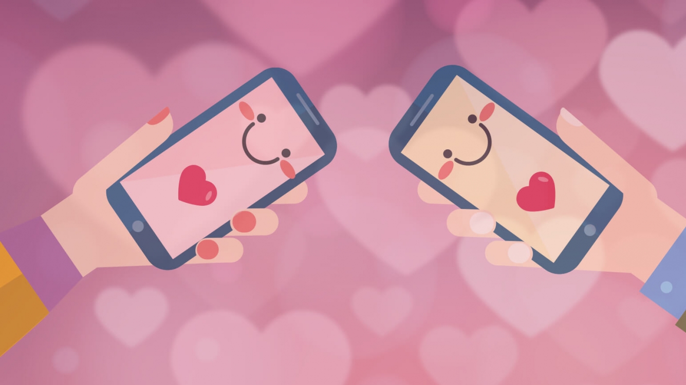


Valentine’s is here - aren’t we all looking for love? But how do we find “the one”? Dating apps, of course! Tinder to Coffee Meets Bagel to Bumble - there seems to be an infinite selection of ways to swipe your way to true love - or at the very least, a chance to change up your solo weekend pizza + Netflix plans for once! This Valentine’s at Hubnest, we’re breaking down 5 elements of a well-designed dating app:

1. TMI?! - The Right Information
People using dating apps for flings will want to know different details about potential matches compared those on the lookout for serious relationships. If the app is meant to be more superficial, prioritize featuring photos most prominently. On the flip-side, if the goal is to establish meaningful connections, focus on common interests and personality traits. Let’s be honest, if you’re only going out a couple of times, does it matter if your date is a dog or cat person?

2. Love at First Swipe! - Easy and Fun Interactions
Dating apps have the repetitive swiping gestures as you sort through potential matches (whether it’s for twenty minutes playing around with friends, or three hours while laying in bed and – we’ve been there – eating way too much pad thai takeout). The card-swiping style has taken the online dating experience by storm - not to mention the entire “swipe left” “swipe right” cultural phenomenon. Interaction gestures that are unique to the app helps make it stand out! A prime example is Bumble’s “Backtrack” feature where you can bring back a potential match that you accidentally no to by shaking your phone, and Tinder’s “Super Like” function, where you can really let someone know that you really really really like them (thanks Carly Rae!). Swiping through a seemingly infinite stack of singles makes users feel that there’s limitless options for finding “the one,” adding a sense of familiarity for new and experienced users alike.


3. It’s a Match! - Creative Visual Language and Copy
Copy should easily get across the fun and potential each user has at their fingertips, effectively explaining it’s purpose and how to use the app, while keeping things light. Even though they only last for a few seconds, loading screens present the perfect opportunity to set up expectations for what the app is like. Tinder’s loading screen sets up the idea that it’s for fun and nothing too serious. Compared, the Coffee Meets Bagel loading screen images and copy gives the impression of users looking for something more long-term than a fling. Great loading screens keep us excited, and our romantic hearts always coming back for more!
4. How Do I Look?! - Customizable Identity
Let’s be honest, dating apps place a lot of importance on looks. Users should have a solid amount of options when it comes to customizing their dating profiles. Just the same as people can influence the way they’re perceived in real life - by body language, clothing choices, speech - a dating profile is an extension of themselves and should reflect who they are. Strike a cheeky balance between pre-loaded likes, interests, photos, and empty spaces with writing prompts for users to tell more about themselves. Most information taken from linked social media profiles should be able to be changed, so that people are comfortable with the information they’re sharing. Shouldn’t we all be able to keep our Keeping Up With The Kardashians obsession under wraps until after the first date? The aim should be for people to feel in control and creative, without breaking down into an existential crisis when they can’t list 5 interests or an inspiring quote (again, haven’t we all been there?).

5. Check This Out! - Easy to View Profiles
If you thought swiping through photos couldn’t get any easier on a dating app, you’d be surprised - Bumble has done exactly that. Same as Tinder, you swipe potential matches left and right. Taking it one step further, Bumble has enabled an up and down swipe function to view photos without having to click into a profile and click out . On Tinder, users have to press into a person’s profile to see more photos of them - which increases the chances of accidentally swiping away the perfect match. Bumble definitely takes the cake on ease of checking out potential matches!
This Valentine’s, we hope you’re feeling the love for great design just as much as we are - We’re forever swiping right. What about you?