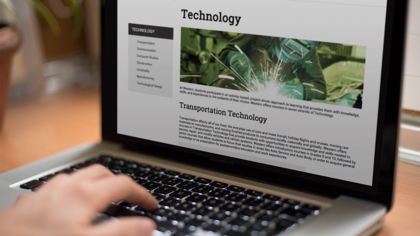
It’s in the web gospel that “95% of web design is typography”. While images are important, content creation continues to be relevant for SEO success in 2015. This makes quality content creation vital in attracting returning visitors. The art of styling and arranging text on print or web in a harmonious visual manner is typography. It is the foundation of design and communication as it greatly affects readability, accessibility, usability, and the overall layout of the site.
The rise in mobile users has pushed the Internet from static to responsive that considers the variety of screen sizes and resolutions. Designing a layout with readable font that adapt to variety of screen sizes is vital to ensure the best user experience from any device.
Here are tips on effective web typography, as we continue to find ways of improving user experience:

Contrast
Online readers scan written text, not read word for word. Having contrast will emphasize on certain text that have more significance than others. Establish a harmonious contrast in your web typography and make your message pop:
- Mix different fonts from different classifications. Using two typefaces that look the same can look like a mistake to the average eye. Combining a strong or decorative typeface for a header with a neutral and simple typeface for the paragraph give a proper contrast.
- Instead of looking for two fonts that are completely different, use different weight and style (ie, bold and italic) to display contrast.
- Show dominance in your message through different sizing. The larger the size, the more important the message holds whilst the supporting data will be in smaller size.

Hierarchy
Hierarchy can effectively break down information so that it is more readable, allowing readers to focus on the most important information first. It can be achieved using size, weight and type style to properly lead the readers through the site
- Scale: Use a consistent scale for your heading, title, sub title, and body throughout the site. This means that your headings should be in bigger font than your H2, while the body text will be smaller than your headers and titles.
- Weight: Bolded words for titles are great to emphasize text and dominance. A large size, yet lightweight font can also be used for the title.
- Uppercase / Lowercase: All caps draw more attention to the text.
- Other factors to consider include colour, positioning, and spacing.

Readability
The size of the body text doesn’t fall into the designer’s favor but on how words, phrases, and paragraphs are easily readable and comprehensible.
- In general, the body text should not be smaller than 16px (browser default for 1 em) This ensures readability for the majority of your audience while the H1 (heading) is suggested to be 3 em.
- Letter/word spacing – Big spacing around the words can disrupt the flow of the text, which will also disturb your readers. You shouldn’t change letter spacing within lowercase body text. However, letter/word spacing can be explored creatively to have different effects for a particular mood.
- Line height – Spacing between lines of text should be adjusted to achieve optimum readability (generally 150% of the text height).
- Column width – The number of characters on one line should be no more than 66 characters. However on mobile screens it should be reduced to 35 – 40 characters.
Other tips
- Use as few typefaces as possible (less than 3)
- Use typefaces that have similar structure (ie, similar x-height and similar shape) in order for them to work well together
- Consider the mood of the message. Choose the appropriate font for your subject matter.
Make sure the font is web-safe to ensure that it will show up on most browsers. Font Stacks offer flexibility which allows you to have backup fonts in case a viewer don’t have the specific font installed on their computer. Services like @font-face, Typekit and Google fonts are good alternatives, but always consider browser compatibility.


